Ion Rebrand
packaging · hair · self care
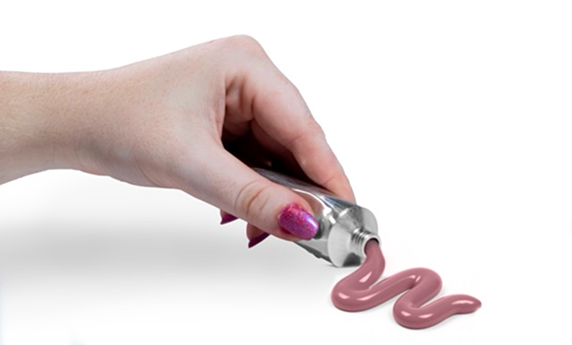
This rebrand celebrates the gentle, nurturing spirit at the core of Ion, rooted in the belief that caring for your hair is also a way of caring for yourself. Guided by the brand’s soft and reassuring voice, the new identity reflects hair care as a calm and personal ritual supported by products that are practical, reliable, and quietly transformative. Through soothing color, thoughtful structure, and clear organization, it turns everyday routines into small moments of comfort and confidence where users feel cared for and at ease.
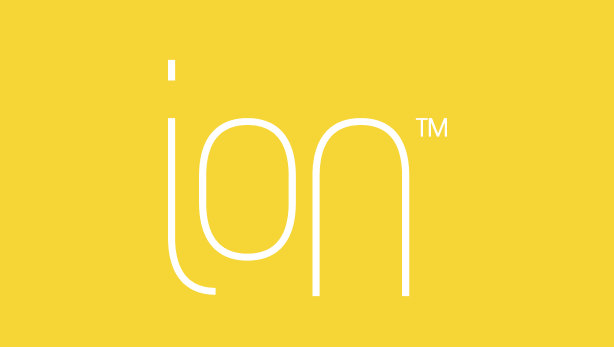
Logo
The new Ion logotype is designed to feel calming, nurturing, and rooted in care. Inspired by Arobotek but softened for a gentler touch, each letterform reflects the brand’s tender spirit. The i cradles the o to create a moment of warmth, while the n feels steady and grounded. Together, the letters form an easy, flowing rhythm that mirrors the comfort of a soothing hair-care ritual.
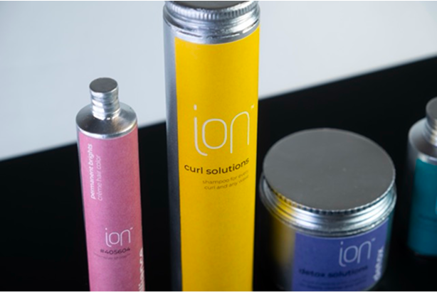
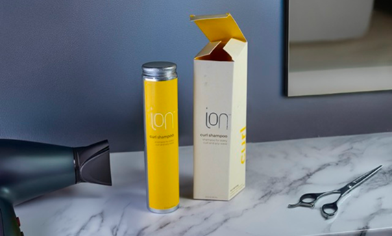
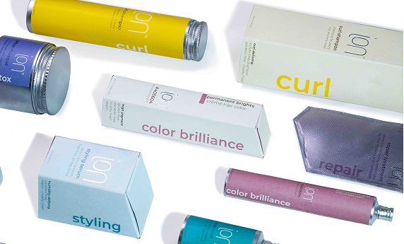
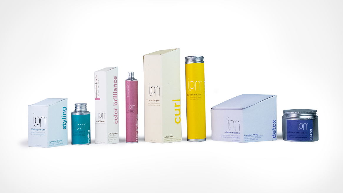
Primary Packaging
The primary packaging is designed to feel simple, lasting, and dependable. Each aluminum bottle offers infinite recyclability and carries the color of the secondary box so the warmth of the system stays with the user long after the outer packaging is gone. The clean cylindrical forms emphasize Ion’s practical, straightforward nature while gently contrasting the angled shape of the box. The result is a clear and sustainable system that feels quietly reassuring.
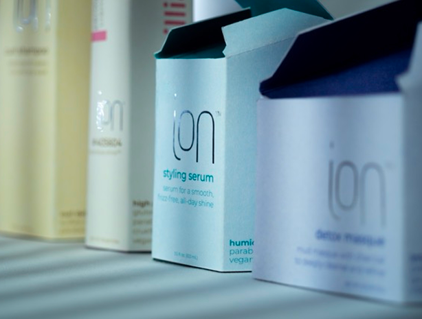
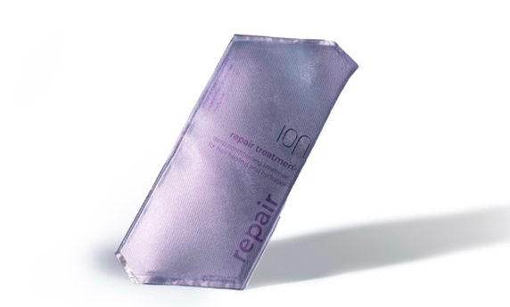
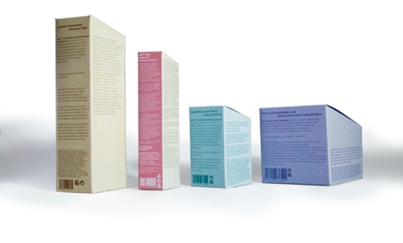
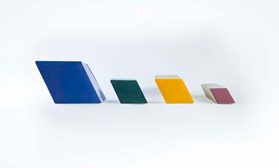
Secondary Packaging
The secondary packaging introduces Ion with a warm and welcoming first impression. Its angled structure reveals three visible sides from the front, adding gentle dimension before the box is opened. The exterior features a soft, muted color, while the inside reveals a brighter, more radiant tone that feels like a breath of fresh air. This simple reveal of light and warmth reflects Ion’s nurturing spirit and sets the stage for the care inside.