Cracked Rebrand
packaging · nail polish · self expression
Cracked is a rebrand that I developed in collaboration with
graphic designer Carlita Bryant (carlitabryant.com) for a small, independent nail polish brand with little existing visual identity.
While the brand’s visuals were minimal, its copy revealed a bold, expressive, and rebellious creative voice rooted in experimentation and self-expression. Our goal was to bring that voice to the surface and give it a visual language that could match its energy. Guided by Cracked’s belief in living in the future and treating nail art as a tool for creativity and self-care, we shaped an identity that is loud, experimental, future-forward, and deeply inclusive. The resulting packaging and storytelling speak directly to the indie nail polish and nail artist community, celebrating risk-taking, artistic freedom, and the unapologetic spirit at the heart of Cracked.
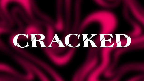
Logo
The final Cracked logo was designed by Carlita Bryant after a deeply collaborative process that involved sketching, refining, and testing over one hundred variations together. We landed on this version because it struck the right balance between elegance and boldness, feeling confident, expressive, and true to Cracked’s rebellious spirit. The letterforms are sharp but intentional,
giving the logo a strong presence while still leaving space for experimentation and creative play across the rest of the
visual system.
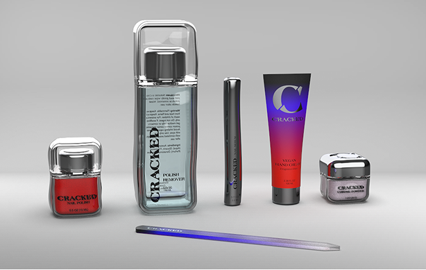
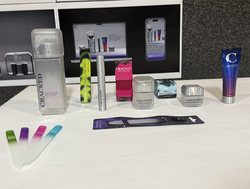
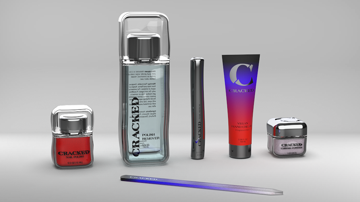
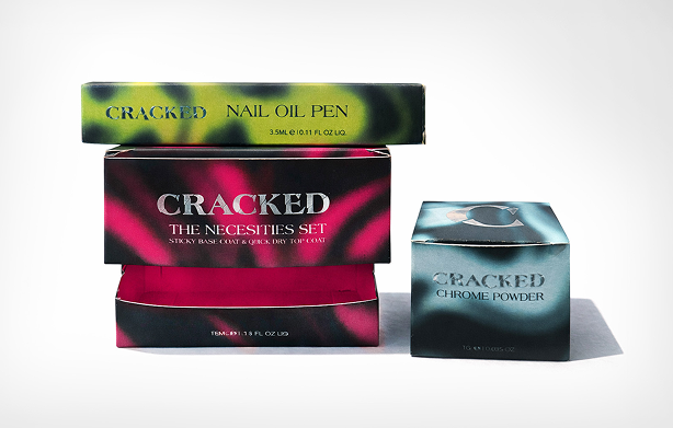
Primary Packaging
Cracked’s new primary packaging begins with simple, familiar forms designed by Carlita, which are then disrupted through a warped, glass-like texture that I developed. This distortion plays on the idea of being ‘cracked’ without relying on literal breaks, using imperfection to push the forms beyond their basic state. The uneven surface adds movement and attitude while still feeling refined. Chrome and black ground the system and give it confidence, creating a bold base that allows color to take the lead in the polish itself and across the broader brand. The result feels tactile, expressive, and future-forward without losing clarity.
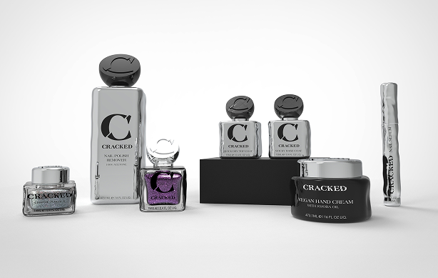
Secondary Packaging
The secondary packaging houses Cracked’s nail polish
products and serves as the most expressive touchpoint within
the packaging system. I designed the secondary packaging as the space where Cracked’s color and graphic language fully come to life. Bold, swirling patterns reflect the way light moves across the chrome primary packaging, creating a dynamic, energetic feel without relying on literal motion. The logo
appears in chrome foil, tying the exterior back to the product inside. Together, these choices give the brand room to be loud, playful, and unapologetically experimental.
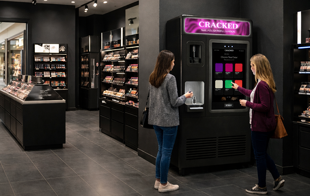
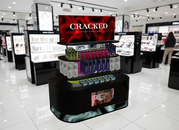
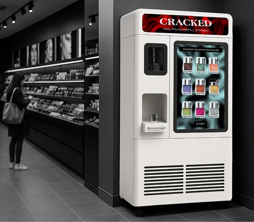
Refill Station
The Cracked refill station rethinks how nail products exist
beyond a single use. Designed as an in-store experience, it
allows customers to refill their favorite shades instead of buying new bottles, making nail art more sustainable and more cost friendly. For Cracked, it creates a long-term system that builds brand loyalty, reduces packaging waste, and supports repeat engagement in a meaningful way. By encouraging reuse and thoughtful consumption, the station benefits both the environment and the brand’s future.
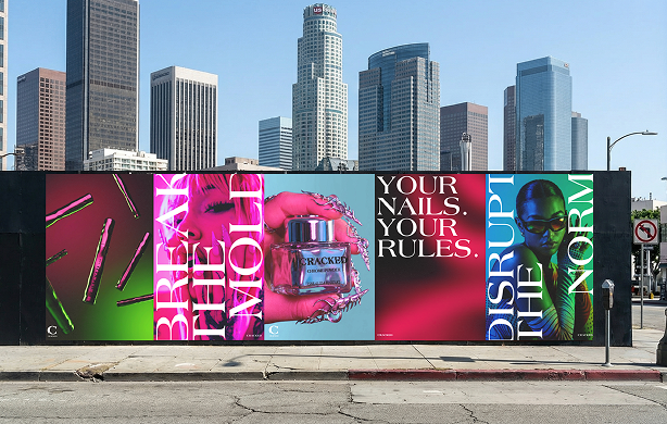
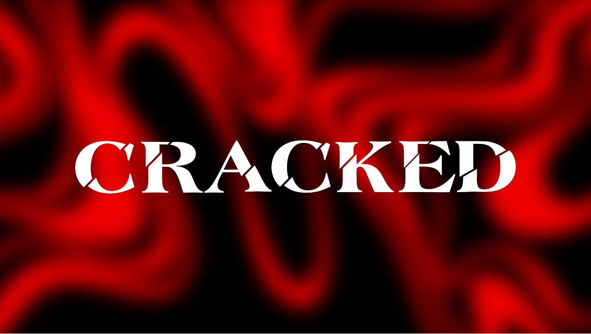
Campaign
The Cracked campaign is the visual culmination of the brand’s new voice. The campaign posters, designed by Carlita Bryant, position Cracked as dramatic and expressive, mirroring the bold, creative world of nail art.
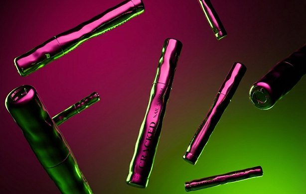
Product Photography Style
The photography style, art directed by me, brings color in through light, letting it move and stretch across the chrome forms. The reflections lean into the warped, imperfect textures, giving the products a sense of energy and attitude. High contrast and saturated color make the images feel bold, expressive, and exciting, echoing Cracked’s experimental spirit.